
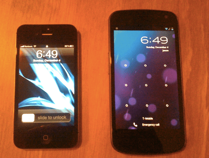
Before me sit two phones. On the left is the iPhone 4S, which I bought (and signed my soul over to Verizon for) in October. On the right sits a loaner GSM version of the Samsung Galaxy Nexus, sporting Android 4.0.
I like the one on the right better. I’ll have to send it back to Google soon, but I’m already certain that through a combination of mysticism and Craigslist I’ll be swapping the iPhone 4S for a Verizon Galaxy Nexus shortly after it launches.
The following is a reflection on how I came to that decision, and why I think the aura of superiority that’s surrounded iOS since its introduction is really more of a residual mist at this point — particularly when compared to Ice Cream Sandwich. iOS is better at some things than Android. And it is prettier. But it is no longer superior.
As regular readers and OMG/JK fans will recall, I’ve been the ‘Android guy’ around TechCrunch since the original Droid came out in November 2009, and have used a Nexus One as my primary phone for the better part of two years now. Before that I had been a pretty diehard iPhone fan, buying one shortly after it came out in 2007 and upgrading to an iPhone 3G the day that device was released. But I fell from the cult of Apple.
This happened for a few reasons. The first is that Apple’s control of the App Store makes me nervous — particularly in light of the fact that they used their control for anticompetitive reasons within the first year of the store’s existence. Point two: Android’s support for Google’s apps and services, which I rely heavily on, is much better. And then there’s the fact that my colleague MG Siegler is, shall we say, enough of an Apple fan for all of us.
That said, it’s been a while since Apple did anything overly inflammatory with the App Store, and I try to eschew dogmatism when it comes to technology, so when the iPhone 4S made its debut I decided to cast my trusty Nexus One aside and ran out to buy one for myself. It’d been a while since I’d used an iPhone as my primary device, and Siri sounded so damn cool. And hey, Verizon had a generous (*scoff*) two-week return policy so I could back out if I really hated the thing.
Given how much I’ve seen Apple zealots fawn over the iPhone 4 and 4S, I had pretty high expectations. I’d swipe-and-unlock the doors to a world of buttery smoothness. After a few weeks back on iOS, I’d doubtless look down on Android users with the same smugness and condescension as some of my peers. “They just don’t know any better,” I’d say. After a two-year exile, perhaps I was coming home.
But I quickly found that while iOS has been better than Android in many respects for the last couple of years, Android has whittled away at that lead.
Quirks and Irks
The first thing that started bugging me on iOS was the new Notifications system. In short, they’re poorly done. I can see why iPhone users might be thrilled with them — they’re a huge step up from the antiquated blue-bubble popup that Apple had relied on since 2007 — but in general I’ve found the new system to be less efficient and messier than Android’s implementation.
There’s no way to clear all of the notifications in your tray — you have to clear them on a per-app basis, and it takes two taps per app to do this. Oftentimes I’ll unlock my phone and have notifications from Facebook Messenger, Google Voice, the default phone app, and maybe OKCupid (bah chicka bawa). That’s eight taps, plus some scrolling, just to clear your notifications. It’s maddening.
And, for another nitpicky but still-illustrative gripe, the fact that I can only choose between 1, 5, or 10 calendar notifications is a thorn in my side. Three would be my sweet spot — any more than that tends to overwhelm my notifications tray, but displaying just one is pretty useless. Yes, I am well aware that Apple sacrifices options to reduce confusion and complexity. But come on.
 And then there’s Siri, which is completely underwhelming (also see fellow TC writer Jordan Crook, who already shared her thoughts on Siri’s lackluster debut).
Apple’s marketing strategy behind Siri has been perfect. The commercials are fantastic, with a real “this is the future, and it’s for everyone” vibe. And those humorous Siri witticisms (“where can I hide a dead body?”) coinciding with the phone’s launch were strokes of genius (my hunch, by the way, is that some of the questions posed by bloggers were actually suggested by someone affiliated with Apple).
But in practice Siri falls prey to the same issues that plague Google’s Android Voice Actions, which I’ve been using regularly for over a year now. Namely, the fact that you need a speedy network connection for it to work at all, and that accuracy is sub-par.
The experience goes something like this: you ask Siri a question, and the three out of five time it nails the answer, and you’re delighted.
But maybe 20% of the time it comes back with a result that’s a bit off — a valiant effort, and you can see it was that close to getting it, but it wasn’t quite there. You give it an approving nod anyway. And then perhaps 20% of the time it just totally misunderstands what you said or fails to get a connection. You sigh a bit and type in the query manually.
After enough of these misses (and their associated sighs), eventually you subconsciously lean away from relying on Siri for mission-critical tasks. You might actively make yourself use it (it was one of the reasons you bought the phone, after all), but you’ll probably conclude that it isn’t really changing the way you interact with your phone. And this all assumes that you like the way Siri works in the first place — I’d personally prefer an assistant that sacrifices chattiness for efficiency, though I understand that Siri’s anthropomorphization is one of its selling points.
Also: Beta, schmeta. Apple fans have repeatedly pointed out that Siri is being billed as a Beta by Apple, and so it shouldn’t be held to such high standards. In my mind Apple lost the ‘Beta’ fallback the moment it started running commercials promoting the feature — some people are buying an iPhone 4S exclusively because of Siri because it’s been so highly touted. Will it be great eventually? Yeah, probably. But it’s not like Google hasn’t seen this coming since the day Siri was acquired by Apple, if not well before.
All of that said, my biggest issue with the iPhone is an old one: the architecture of iOS simply doesn’t let applications play nicely together, and after using Android for so long I feel strangely restricted. It’s as if I’ve spent the last two years in adulthood, doing what I want with whomever I want — and now suddenly I have to ask Apple for permission every time I want to route some of my data into one service or another.
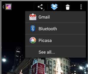
The biggest pain-point for me is Dropbox. On Android, I can be browsing just about anything — a photo, a document, a song — and hit the share button to send it straight to my Dropbox account (or Evernote, or Facebook, or whatever). The icons are easily accessible from the top of the screen. It just works.
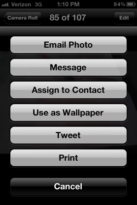
Contrast that with Dropbox on iOS. If you want to upload a photo or video that was taken on your iPhone, you fire up the Dropbox app and upload it from there. Pretty straightforward. But if you want to upload any other type of file, you’d better cross your fingers.
Some applications feature Dropbox integration that will let you save straight to your account, but these integrations are all hardwired on a per-app basis. Which means you can’t assume they’ll be there. And it also means that if you’re fond of a service that’s less popular than Dropbox — one that third-party apps probably aren’t going to go to the trouble to integrate themselves — then you’re going to be totally out of luck. But hey, at least you can tweet about it! (see screenshot at right for the iOS sharing choices).
All of which goes to say, from a functionality perspective, I just don’t think iOS has any significant advantages over Android. iCloud is nice if you live in Apple’s ecosystem, but the only thing I get out of it is photo syncing, which the Google+ app on Android handles just fine.
Which brings us to the other key component that differentiates the two: the user experience.
For as long as I’ve used it, Google has sprinkled Android with bits of ugliness and UI quirks that varied between head-scratching and infuriating. The pervasive puke green. Funky glitches. The ‘Droid’ clock font that made the phone look about as friendly to use as a microwave. The Android Market UI that made browsing for apps a chore. And the apps — why were they always so damn ugly compared to their iOS counterparts?
I’ve never been shy about pointing this out. Over the summer I asked Android’s Senior Director of User Experience Matias Duarte — in front of a few hundred people— why Android applications are generally uglier than iOS apps (read that post for his answer, it has to do with handsome Sicilians and giving developers better tools).
So when I switched from my Nexus One over to the iPhone 4S, it wasn’t really a surprise that iOS’s interface struck a nerve with me. It looks damn good. Granted, it looks largely the same as when I left it in late 2009, but that isn’t a bad thing — unless salivating when you look at a particularly attractive app icon can be considered a bad thing. And the apps, with their pixel-perfect design, are often gorgeous too.
But, as in the case with any relationship, looks only go so far. And eventually I began to miss some of the things I love about Android, like the aforementioned flexibility with exchanging files between apps.
Several weeks later, when I started playing around with Android 4.0 on the Galaxy Nexus, I realized that this ‘looks’ advantage was starting to fade as well. No, Ice Cream Sandwich is not as pretty as iOS 5. It doesn’t have as many nice animations, and there are fewer instances where you say to yourself, ‘Oh, that was a nice touch”. But it’s still good-looking. It’s not a 10, the way iOS is, but I’d give it a 7.5 — maybe an 8 after a few drinks.
More important, the usability of Android is steadily improving too. The removal of the dedicated Menu button is a huge win for users. The multitasking app switcher button is also handy — and more intuitive than iOS’s double-button tap system, I’d argue. You can find more of my thoughts on ICS’s specific features here.
The Long and Short of It
From a looks and polish department, Android will probably always be trailing iOS to some degree. Apple is just too good at what it does — and the fact that developers can optimize for just a handful of screen resolutions means they can put together pixel-perfect designs, whereas Android apps have to be far more flexible with their layouts, which lends itself to blah-ness.
But with Ice Cream Sandwich, Android has reached a sort of tipping point.
Android has always been a mixed bag. Powerful, yes. But not as easy to use as the iPhone, a little bit ugly, and with a perpetual feeling that some screws had been left too loose in the rush to get the software out the door. At times, it’s felt like someone dropped an overpowered V8 engine into a janky sedan chassis.
With ICS, those screws feel like they’ve been tightened. It doesn’t yet have the same polish as iOS, but I no longer feel like I’m having to sacrifice a pleasant experience for the sake of using solid Google apps and Android’s flexibility. In fact, overall, Ice Cream Sandwich has been a joy to use. Though it has yet to make me salivate.
Update: Per commenter request, a word on the weights of each device. The iPhone 4S is five grams heavier than the GSM version of the Galaxy Nexus, clocking in at 140 grams to the Nexus’s 135 grams according to Wikipedia — so they should feel about the same in your hand. But The Nexus actually feels a bit lighter than the numbers would suggest, because it’s significantly larger and the weight is distributed over a larger area.
Source:http://techcrunch.com/2011/12/04/galaxy-nexus-iphone-4s/
I like the one on the right better. I’ll have to send it back to Google soon, but I’m already certain that through a combination of mysticism and Craigslist I’ll be swapping the iPhone 4S for a Verizon Galaxy Nexus shortly after it launches.
The following is a reflection on how I came to that decision, and why I think the aura of superiority that’s surrounded iOS since its introduction is really more of a residual mist at this point — particularly when compared to Ice Cream Sandwich. iOS is better at some things than Android. And it is prettier. But it is no longer superior.
As regular readers and OMG/JK fans will recall, I’ve been the ‘Android guy’ around TechCrunch since the original Droid came out in November 2009, and have used a Nexus One as my primary phone for the better part of two years now. Before that I had been a pretty diehard iPhone fan, buying one shortly after it came out in 2007 and upgrading to an iPhone 3G the day that device was released. But I fell from the cult of Apple.
This happened for a few reasons. The first is that Apple’s control of the App Store makes me nervous — particularly in light of the fact that they used their control for anticompetitive reasons within the first year of the store’s existence. Point two: Android’s support for Google’s apps and services, which I rely heavily on, is much better. And then there’s the fact that my colleague MG Siegler is, shall we say, enough of an Apple fan for all of us.
That said, it’s been a while since Apple did anything overly inflammatory with the App Store, and I try to eschew dogmatism when it comes to technology, so when the iPhone 4S made its debut I decided to cast my trusty Nexus One aside and ran out to buy one for myself. It’d been a while since I’d used an iPhone as my primary device, and Siri sounded so damn cool. And hey, Verizon had a generous (*scoff*) two-week return policy so I could back out if I really hated the thing.
Given how much I’ve seen Apple zealots fawn over the iPhone 4 and 4S, I had pretty high expectations. I’d swipe-and-unlock the doors to a world of buttery smoothness. After a few weeks back on iOS, I’d doubtless look down on Android users with the same smugness and condescension as some of my peers. “They just don’t know any better,” I’d say. After a two-year exile, perhaps I was coming home.
But I quickly found that while iOS has been better than Android in many respects for the last couple of years, Android has whittled away at that lead.
Quirks and Irks
The first thing that started bugging me on iOS was the new Notifications system. In short, they’re poorly done. I can see why iPhone users might be thrilled with them — they’re a huge step up from the antiquated blue-bubble popup that Apple had relied on since 2007 — but in general I’ve found the new system to be less efficient and messier than Android’s implementation.
There’s no way to clear all of the notifications in your tray — you have to clear them on a per-app basis, and it takes two taps per app to do this. Oftentimes I’ll unlock my phone and have notifications from Facebook Messenger, Google Voice, the default phone app, and maybe OKCupid (bah chicka bawa). That’s eight taps, plus some scrolling, just to clear your notifications. It’s maddening.
And, for another nitpicky but still-illustrative gripe, the fact that I can only choose between 1, 5, or 10 calendar notifications is a thorn in my side. Three would be my sweet spot — any more than that tends to overwhelm my notifications tray, but displaying just one is pretty useless. Yes, I am well aware that Apple sacrifices options to reduce confusion and complexity. But come on.
And then there’s Siri, which is completely underwhelming (also see fellow TC writer Jordan Crook, who already shared her thoughts on Siri’s lackluster debut).Apple’s marketing strategy behind Siri has been perfect. The commercials are fantastic, with a real “this is the future, and it’s for everyone” vibe. And those humorous Siri witticisms (“where can I hide a dead body?”) coinciding with the phone’s launch were strokes of genius (my hunch, by the way, is that some of the questions posed by bloggers were actually suggested by someone affiliated with Apple).
But in practice Siri falls prey to the same issues that plague Google’s Android Voice Actions, which I’ve been using regularly for over a year now. Namely, the fact that you need a speedy network connection for it to work at all, and that accuracy is sub-par.
The experience goes something like this: you ask Siri a question, and the three out of five time it nails the answer, and you’re delighted.
But maybe 20% of the time it comes back with a result that’s a bit off — a valiant effort, and you can see it was that close to getting it, but it wasn’t quite there. You give it an approving nod anyway. And then perhaps 20% of the time it just totally misunderstands what you said or fails to get a connection. You sigh a bit and type in the query manually.
After enough of these misses (and their associated sighs), eventually you subconsciously lean away from relying on Siri for mission-critical tasks. You might actively make yourself use it (it was one of the reasons you bought the phone, after all), but you’ll probably conclude that it isn’t really changing the way you interact with your phone. And this all assumes that you like the way Siri works in the first place — I’d personally prefer an assistant that sacrifices chattiness for efficiency, though I understand that Siri’s anthropomorphization is one of its selling points.
Also: Beta, schmeta. Apple fans have repeatedly pointed out that Siri is being billed as a Beta by Apple, and so it shouldn’t be held to such high standards. In my mind Apple lost the ‘Beta’ fallback the moment it started running commercials promoting the feature — some people are buying an iPhone 4S exclusively because of Siri because it’s been so highly touted. Will it be great eventually? Yeah, probably. But it’s not like Google hasn’t seen this coming since the day Siri was acquired by Apple, if not well before.
All of that said, my biggest issue with the iPhone is an old one: the architecture of iOS simply doesn’t let applications play nicely together, and after using Android for so long I feel strangely restricted. It’s as if I’ve spent the last two years in adulthood, doing what I want with whomever I want — and now suddenly I have to ask Apple for permission every time I want to route some of my data into one service or another.
The biggest pain-point for me is Dropbox. On Android, I can be browsing just about anything — a photo, a document, a song — and hit the share button to send it straight to my Dropbox account (or Evernote, or Facebook, or whatever). The icons are easily accessible from the top of the screen. It just works.
Contrast that with Dropbox on iOS. If you want to upload a photo or video that was taken on your iPhone, you fire up the Dropbox app and upload it from there. Pretty straightforward. But if you want to upload any other type of file, you’d better cross your fingers.
Some applications feature Dropbox integration that will let you save straight to your account, but these integrations are all hardwired on a per-app basis. Which means you can’t assume they’ll be there. And it also means that if you’re fond of a service that’s less popular than Dropbox — one that third-party apps probably aren’t going to go to the trouble to integrate themselves — then you’re going to be totally out of luck. But hey, at least you can tweet about it! (see screenshot at right for the iOS sharing choices).
All of which goes to say, from a functionality perspective, I just don’t think iOS has any significant advantages over Android. iCloud is nice if you live in Apple’s ecosystem, but the only thing I get out of it is photo syncing, which the Google+ app on Android handles just fine.
Which brings us to the other key component that differentiates the two: the user experience.
For as long as I’ve used it, Google has sprinkled Android with bits of ugliness and UI quirks that varied between head-scratching and infuriating. The pervasive puke green. Funky glitches. The ‘Droid’ clock font that made the phone look about as friendly to use as a microwave. The Android Market UI that made browsing for apps a chore. And the apps — why were they always so damn ugly compared to their iOS counterparts?
I’ve never been shy about pointing this out. Over the summer I asked Android’s Senior Director of User Experience Matias Duarte — in front of a few hundred people— why Android applications are generally uglier than iOS apps (read that post for his answer, it has to do with handsome Sicilians and giving developers better tools).
So when I switched from my Nexus One over to the iPhone 4S, it wasn’t really a surprise that iOS’s interface struck a nerve with me. It looks damn good. Granted, it looks largely the same as when I left it in late 2009, but that isn’t a bad thing — unless salivating when you look at a particularly attractive app icon can be considered a bad thing. And the apps, with their pixel-perfect design, are often gorgeous too.
But, as in the case with any relationship, looks only go so far. And eventually I began to miss some of the things I love about Android, like the aforementioned flexibility with exchanging files between apps.
Several weeks later, when I started playing around with Android 4.0 on the Galaxy Nexus, I realized that this ‘looks’ advantage was starting to fade as well. No, Ice Cream Sandwich is not as pretty as iOS 5. It doesn’t have as many nice animations, and there are fewer instances where you say to yourself, ‘Oh, that was a nice touch”. But it’s still good-looking. It’s not a 10, the way iOS is, but I’d give it a 7.5 — maybe an 8 after a few drinks.
More important, the usability of Android is steadily improving too. The removal of the dedicated Menu button is a huge win for users. The multitasking app switcher button is also handy — and more intuitive than iOS’s double-button tap system, I’d argue. You can find more of my thoughts on ICS’s specific features here.
The Long and Short of It
From a looks and polish department, Android will probably always be trailing iOS to some degree. Apple is just too good at what it does — and the fact that developers can optimize for just a handful of screen resolutions means they can put together pixel-perfect designs, whereas Android apps have to be far more flexible with their layouts, which lends itself to blah-ness.
But with Ice Cream Sandwich, Android has reached a sort of tipping point.
Android has always been a mixed bag. Powerful, yes. But not as easy to use as the iPhone, a little bit ugly, and with a perpetual feeling that some screws had been left too loose in the rush to get the software out the door. At times, it’s felt like someone dropped an overpowered V8 engine into a janky sedan chassis.
With ICS, those screws feel like they’ve been tightened. It doesn’t yet have the same polish as iOS, but I no longer feel like I’m having to sacrifice a pleasant experience for the sake of using solid Google apps and Android’s flexibility. In fact, overall, Ice Cream Sandwich has been a joy to use. Though it has yet to make me salivate.
Update: Per commenter request, a word on the weights of each device. The iPhone 4S is five grams heavier than the GSM version of the Galaxy Nexus, clocking in at 140 grams to the Nexus’s 135 grams according to Wikipedia — so they should feel about the same in your hand. But The Nexus actually feels a bit lighter than the numbers would suggest, because it’s significantly larger and the weight is distributed over a larger area.
Source:http://techcrunch.com/2011/12/04/galaxy-nexus-iphone-4s/
No comments:
Post a Comment